
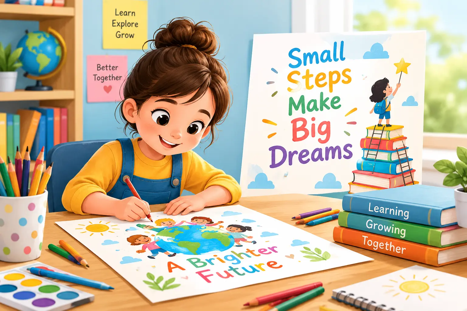
How to Create An Attractive Educational Poster Illustrations
Table of Contents
The process of creating an educational poster is more difficult than it seems to be because you have to create a piece of work that can attract learners’ attention, provide a clear explanation of the matter and maintain their interest, but too much information makes your poster boring, while too many pictures make it chaotic.
The best poster is the one which helps a person get the information easily without having to think much. The good thing is that designing such a poster will be much easier once you consider the learner in your poster planning. Let’s look at how to create a poster that teaches and attracts attention.
What Makes an Educational Poster Attractive?
An educational poster is not just a poster with bright colours, huge illustrations and a lot of decorations. It should contain valuable information understandably. Good Poster Illustrations work as an additional help to the topic and not as a rival.
Thus, an educational poster about the water cycle may have a picture illustrating evaporation, condensation, and precipitation rather than its description. There is a lot of research to back up this idea. Richard Mayer’s extensive literature review showed that the integration of words and relevant graphics can be more beneficial to learning than words alone.
A strong educational poster should therefore have:
- One clear learning goal
- Simple and relevant illustrations
- Readable text
- A logical visual order
- Enough space to avoid clutter
How Do You Choose the Right Illustration Style?
Begin by considering the learner before the style of the drawing. When creating a poster for a kid and another one for university students, the visuals used will not be the same. Kids generally like images that are drawn in a simplified manner with characters, objects, faces, and shapes, whereas older students need illustrations, diagrams, charts, etc.
The topic is also significant. While scientific posters require labelled diagrams, posters created to aid in language learning can make use of the characters in everyday scenarios. Consistency is crucial. Where all the images look like they belong to separate posters, the whole poster will appear to be messy despite all the good illustrations.
How Can You Create a Clear Visual Hierarchy?
The audience should understand what they have to look at first, then second and then third without even having to think about it. In the first place, you have to start with the main title or the prompt for your work. You’ll put the main illustration/fact on your design, while the rest of the facts will be arranged around this one.
For example, when creating an informative poster about healthy foods, you can use the main illustration of the dish in the centre with all other illustrations of fruits, vegetables, grains, and protein surrounding it.
What Factors to Consider For Determining Size and Format?
The size of an educational poster may affect the readability of the content. When deciding on the poster size, consider the intended use of the poster. If it is meant for classroom wall mounting, then the size and images must be such that they can be read from afar. On the other hand, a handout allows you to incorporate small images.
In case the poster is digital, consider the screen and format to be used when designing the poster. A poster that is meant to be viewed on a phone requires a different format from one that will be projected on a classroom screen.
Some of the considerations are as follows:
- Use bigger illustrations for distant viewers.
- Make sure the headings and labels are readable even when not zoomed in.
- Ensure there is adequate margin for printing.
- Test the design at its actual viewing size.
- Adjust layout rather than changing dimensions.
What Colours Are Ideal for Educational Posters?
Colour should help in organising the data rather than simply making the poster visually attractive. You should select a few colours and assign them particular purposes. For example, blue could be used for water, green for plants, while orange could signify an important fact.
Consistency in using colours also helps in establishing connections in the minds of students much quicker. You should avoid having light colours against light backgrounds and mixing too many bright colours. Good contrast is especially necessary if your poster is going to be printed or viewed at a distance.
Colour can also be used as a guide for the viewer’s attention. In 27 experiments performed on 2,464 subjects, it was discovered that visual cues, such as colour-coding, have a medium effect size on comprehension and transfer of learning, particularly for students with little knowledge beforehand.
How to Make Educational Illustrations Engaging for Children?
If you have to illustrate educational books for kids, the children’s book illustration has to look accessible in the first place. The following advice on how to do illustrations for kids’ books can prove useful. Characters, faces, setting, and story in the picture will bring the child closer to the topic.
If a poster educates kids on the subject of road safety, it should not provide them with a list of dos and don’ts. What would be better than showing a picture of a child waiting by the crossing, looking around, waiting for the signal to cross the street, and going ahead safely? However, don’t add any elements to the image if they have no specific role to play.
How to Balance Text and Illustrations?
It would be the easiest way to make one’s material look untidy to place all the text and try to add the illustrations. In fact, one should find out what is essential for the learner and make the accompanying texts brief, letting the illustrations contain necessary information.
Multimedia learning research often draws attention to the need to reduce superfluous material. As regards Mayer’s findings, coherence and signalling design principles are considered important, as superfluous information might distract one’s attention from the learning process. Try to:
- Use short explanations instead of large paragraphs
- Place labels close to the relevant illustration
- Keep related text and visuals together
- Leave comfortable margins around major elements
- Remove decorative details that do not support the lesson
The goal is not to make the poster empty. It is to make every element earn its space.
How Can You Make the Poster More Memorable?
A memorable poster will always have something to connect to it. This might be a narrative, a familiar figure, an analogy, or an event sequence. For example, a poster describing the process of growth of a plant will be presented through the images of a seedling, a sprout, a sapling and a mature plant.
This technique can be used if the same theme will be covered in different types of educational materials in the future. The style of illustration designed for a poster can be easily ebook Illustration, used in worksheets, or classroom handouts.
What Common Mistakes Should You Avoid?
Various small mistakes can affect the understanding of the poster, despite it being informative.
Too Much Information
It is usually difficult to cover all the information in one poster. Select only the necessary information.
Decorative Pictures
An illustration that looks good but conveys no information distracts from the information itself.
Inconsistency in Style
The combination of various styles (realistic pictures, cartoon characters, icons, random images) makes the poster look disordered.
Lack of Contrast
When the text merges with the background, all the information is useless.
Bad Arrangement
When the poster is overcrowded, it does not provide any space for the viewer’s eyes. Space helps to separate information.
How Do You Create an Educational Poster Step by Step?
There is an easy way which may assist you in making sure that everything is done right while making your poster.
- Set up your educational goal: What should the viewer learn when looking at the poster?
- Know your audience: Their age, knowledge about the topic, and literacy level.
- Develop content of the poster: Simplify the information to what would bring the viewer closer to his goal.
- Design the poster layout: Set up positions of the title, main illustration, additional illustrations and text.
- Choose the illustration style: Pick the colours, characters, shapes, and the methods of illustrating for your audience.
- Create the main illustration: Begin with the illustration that tells the main idea.
- Supply additional information: Place the labels and comments near the relevant illustrations.
- Check the poster: Eliminate the unnecessary elements and make sure the main idea is clearly understood.
Readers Usually Ask
Why should an educational poster be effective?
For an educational poster to be effective, there should be proper communication, illustration, writing, colouring, and layout. All illustrations should go well with the objective.
How many illustrations should an educational poster have?
There is no certain number of illustrations that an educational poster should have. This depends on the content and the intended audience.
Should educational posters make use of cartoon illustrations?
This is possible, but it will depend on what the poster aims to communicate and to whom. At times, the best illustration might simply be a diagram.
Can the same illustrations be used in ebooks?
Yes. They just need adjustments in terms of dimensions and resolution.
To Conclude!
The poster doesn’t have to be too colourful, textual, or complicated. Its purpose is to highlight some facts which will be easily perceived and understood. Consider the one whom you want to teach something first, and then design a poster in such a way. Consistency in visual idea, minimal number of elements and usage of colours and space will lead to the result where each element will perform its own function.

My writing for ChildrenIllustration.co.uk delves into the area of creative book art for young readers. I’m interested in how pictures contribute to the development of characters, scenes, and emotions in a tale. My writings contain concepts that motivate writers, publishers, and artists alike. This place is dedicated to telling visually compelling stories.